
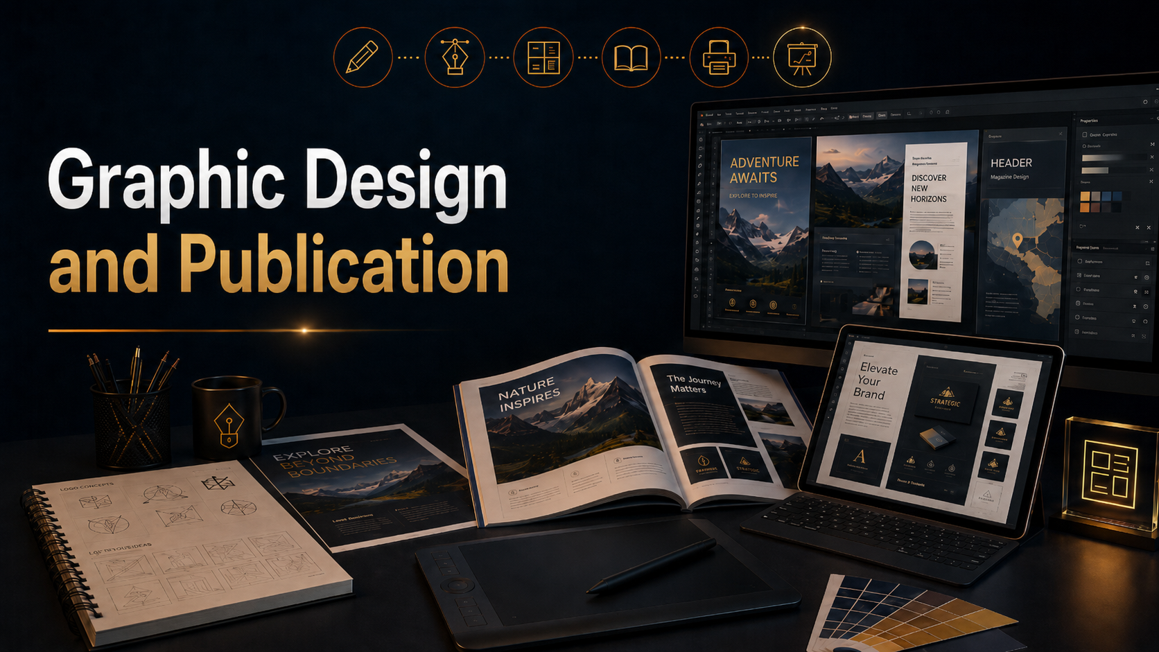
Graphic design and publication coursework developed my ability to create visual communication systems for print, digital media, branding, and professional presentation. This section includes projects created with Adobe Illustrator and Adobe InDesign, along with supporting design work that explores layout, typography, hierarchy, composition, visual identity, and audience-focused communication.
Through these projects, I created brand-building assets such as logos, magazines, brochures, maps, posters, publication layouts, and other designed materials. Each project required decisions about structure, spacing, type, color, imagery, alignment, and how the viewer would move through the information. The goal was not only to make the work visually appealing, but to make it clear, organized, memorable, and useful.
Adobe Illustrator was used to create vector-based design assets, including logos, icons, graphics, maps, illustrations, and scalable brand elements. This helped me understand how clean shape construction, visual balance, line quality, and simplified forms can create stronger communication. Illustrator also helped me develop assets that could be used across different formats without losing quality.
Adobe InDesign was used to build more complete publication projects, including magazine layouts, brochures, posters, and multi-page documents. This work developed my understanding of grids, columns, margins, typography, image placement, page flow, and editorial structure. Publication design requires more than placing text and images on a page. It requires control over rhythm, hierarchy, pacing, and the relationship between written content and visual design.
The projects in this section show how graphic design can support brand identity, storytelling, information design, and professional communication. They demonstrate the process of turning ideas into finished visual materials that can inform, promote, guide, or persuade an audience.
Use the links on this page to explore the individual graphic design and publication projects. Each project shows a different part of the design process, from early concept and layout decisions to finished brand assets, printed materials, and publication-ready compositions.
Explore my progress through these links
Starship Team STEAM in Education Assets
College Portfolio projects
Photography
Advanced Image Editing
Digital Video
Directing & Production
Video Editing
Graphic Design
Web Design
Infographics & Data Visualization
3D Design
Digital Illustration
Digital Storytelling
Digital Portfolio
E-Book Design & Publishing
UI/UX User Interface & User Experience
Social Media Marketing
Integrated Study Honors
